The Site Challenge
Passenger stations take up a LOT of space on a layout. Perhaps that is the main reason most layouts do not model them. The other reason, best kept for a later discussion, is that most of the modelers I know view passenger trains as boring, merely a moving display or operational obstacle circling the layout without switching opportunities. A working passenger operation requires the passenger station as its anchor point, but it includes multiple operations that consume layout space: passenger tracks for through trains, switching tracks for passenger equipment changes (coaches, food service, head-end equipment), plus Mail and Express terminals, business car tracks and Coach Yard.
These operations consume nearly half the space on the main level of my layout. Even with ample space, building a station that is a suitable structure for such a major operation is a real challenge. Being modeled as a Union Station (mine hosts Southern Pacific, Union Pacific, Santa Fe), the structure must be able to hold, feed and move hundreds of passengers at a time. Most commercially-available station kits are just not up to the task. Ogden Union Station is a good example of the footprint of a busy through station:
Measuring over 400' long, Ogden Union Station is a city within a building. It is capable of serving over 150 trains a day and thousands of passengers boarding or getting off the trains. My station must be a suitably impressive building, housing all of the facilities shown in this plan. But where to put it? The other challenge my layout presents is the track arrangement - namely, the mainline is toward the back of the layout with the passenger ladder building in front of it, which forces the passenger terminal to the front of the layout
A Solution: San Bernardino Station
While at a train show in Evanston, Wyoming, yesterday, I found a new limited-run kit of the San Bernardino Station. Celebrating its centenary on July 15, 2018, this impressive station is a masterpiece of the Mission Revival Style as applied to railroad stations throughout California. The kit by Red River Models has the perfect footprint and style for the passenger station.
Constructed of laser-cut MDF, the kit's footprint is perfect for my station structure. This kit is for a background version of the model, which suits the building site very well because its back can be cut open to create interior vignettes looking out on the tracks. These vignettes both reproduce the energy of a busy 1950s passenger station and create an in-scale forced perspective onto the platform from the passenger's perspective. This view will require some modification of the kit, but it is a welcome challenge.
It seems entirely coincidental that my station's tracks bear a resemblance to the San Bernardino Station. I sought to build a through station for the available space. Only after laying out the ladder and setting the tracks for mail and express terminals did I notice, while thumbing through Jeff Asay's Union Pacific in the Los Angeles Basin, several views of the San Bernardino Depot. Served by both Union Pacific and Santa Fe, it is a prototype - both in its design and classic Mission Revival Style - from which I can model an impressive passenger station for the Overland Terminal Railway Company. Kismet.
Its sturdy tab construction made it easy to assemble a mock-up to test its fit to the site.
Butting the model to the edge of the layout provides a prototypically spacious platform, centered on the passenger ladder. Off to the sides there is ample room for taxi stands, local buses, and parking - all necessary to give a station a realistic bustling atmosphere. This view best shows how the station itself sits on the Depot site with the ladder and space for open platforms radiating out from the portico. The mockup viaduct in the background provides a good visual frame for punctuating this as a very busy scene. The viaduct also connects the station scene with the urban scene planned for the alcove beyond the station, as seen to the right of this shot.
From the aisle, the station looks like this:
Its spaces easily allow portions of the grand waiting room, offices and Harvey House restaurant to become vignettes for viewing the platforms beyond and the busy flow of traffic. Though not doing justice to the perspectives they create, the following shots give an idea how the station can be viewed as a hub of activity.
First, the grand hall waiting room view to the tracks.
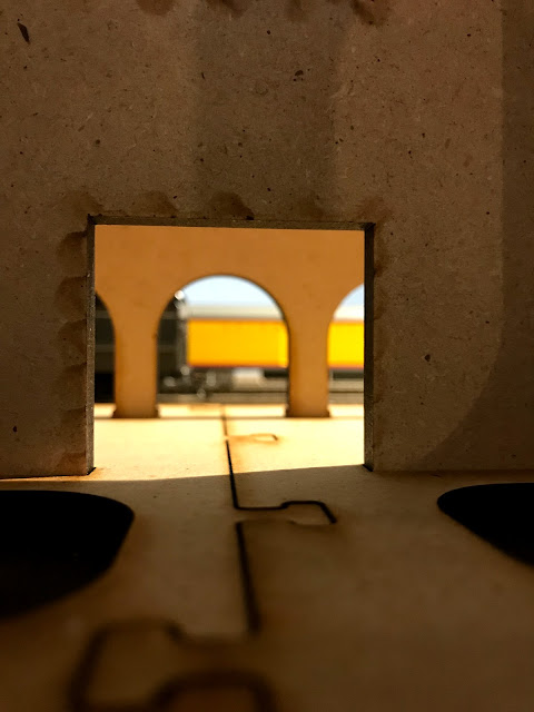
Closeup view through the main doors of the grand hall to the platforms. The arches provide a perfect California touch.
Restaurant view. Imagine Harvey Girls rushing to serve customers waiting for their departures.
Extended portico provides ample monumentality to create a lush, informal outdoor space for this temple of transportation in its 1950s heyday.
The Crown Jewel of a Passenger Operation
As an architectural historian, I approach my layout not just as a place to operate trains, not diminishing the importance of good operation at all, but as a study in urban architecture and the active role of transportation in it. As a temple of transportation, the Depot is meant to be a true centerpiece of the operation, and detailed accordingly. Using the depot itself to direct how the passenger operation is to be viewed and experienced may not be unique, but how it is finished and detailed to create a convincing reality is the ultimate test of its success.


Comments
Post a Comment